Vaulta
A complete marketing website for a fintech platform that turns complex treasury operations into something clear, credible and easy to evaluate.
Overview
Vaulta is a treasury platform designed to bring cash positions, forecasting, payments and financial operations into one workspace.
The website needed to take something normally buried in spreadsheets, banking platforms and finance terminology and turn it into a product that feels understandable and trustworthy from the first visit.
The challenge
Selling financial software requires more than a polished landing page.
Finance teams need to understand what the product does, how it fits into their existing operation, who it is designed for and how sensitive financial actions are controlled.
At the same time, presenting everything at once would make an already complex product harder to understand.
The challenge was to create a large website that could explain the platform progressively without making visitors feel like they were reading technical documentation.
Making the product understandable
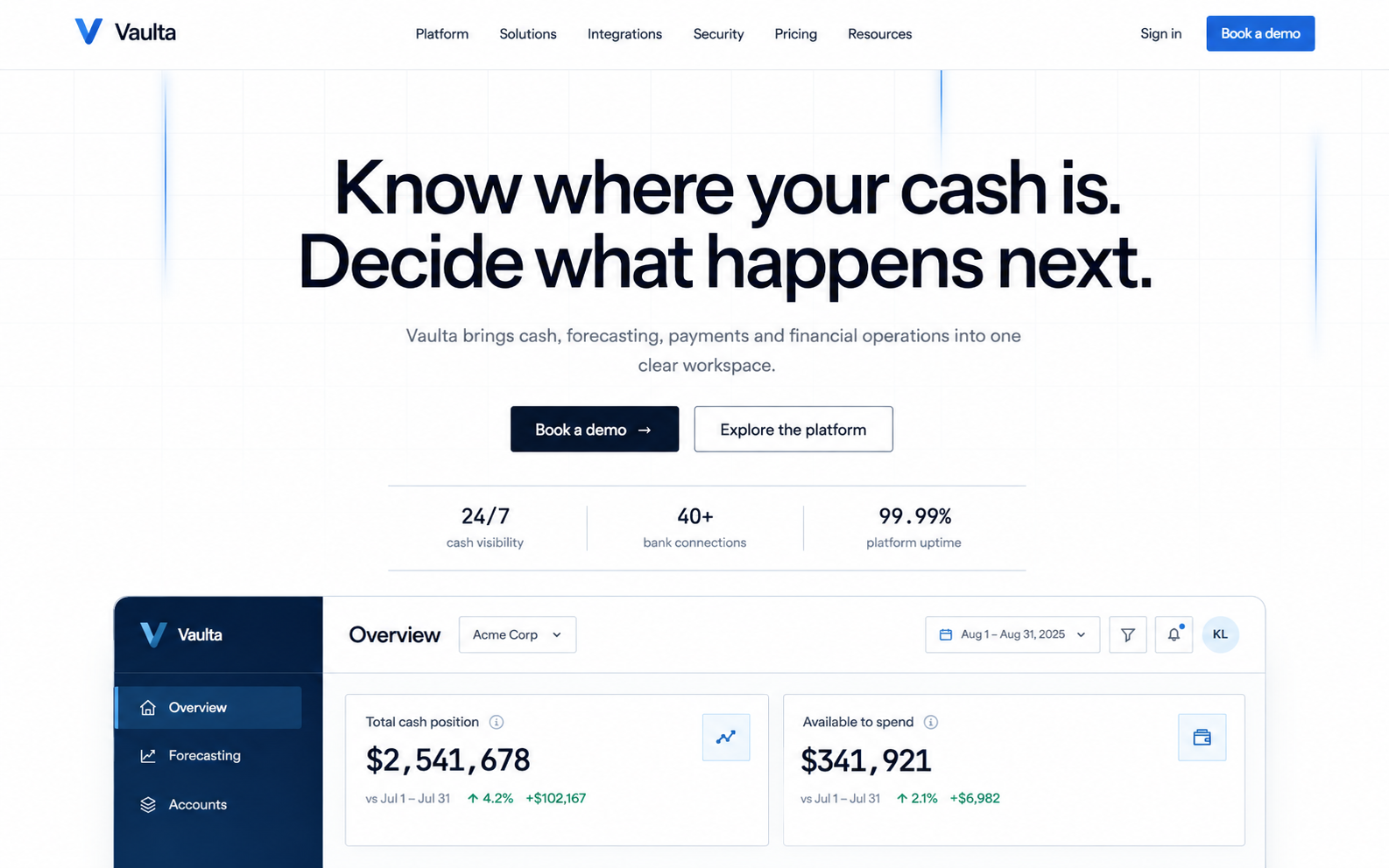
The homepage starts with the outcome rather than the technology: bringing cash, forecasting, payments and financial operations into one place.
Product interfaces are then used throughout the page to show consolidated balances, forecasts, connected accounts, payments and approval states.
Instead of asking visitors to imagine what the software looks like, the website lets them see how information would actually be organised.
Turning a large platform into four clear ideas
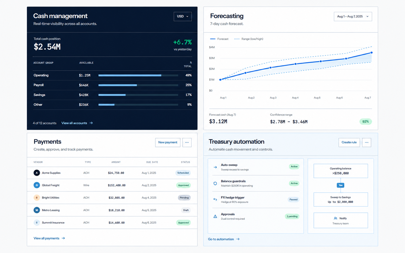
The core product was organised around four jobs:
- Cash management: see accounts, entities and currencies together.
- Forecasting: understand where cash is heading and compare different scenarios.
- Payments: keep evidence, policies and approvals connected to every payment.
- Treasury automation: turn repeatable finance processes into controlled workflows.
Showing how the system works
The dedicated platform experience goes deeper than a normal feature page.
Financial data enters from banks, ERP systems, payroll and payment providers. Vaulta then turns that information into a unified cash position, forecasts and controlled actions.
Interactive product views demonstrate cash operations, forecasting, payment approvals and reporting inside the website itself.
The aim was to show the relationship between the features rather than presenting them as disconnected cards.
Designing around different buyers
A CFO does not evaluate treasury software in the same way as someone running daily cash operations.
The website therefore includes content for finance leaders, treasury teams and controllers, while also explaining how the platform can grow from an early treasury function into a more complex multi-entity operation.
This creates clearer routes through the website depending on what the visitor actually cares about.
Building trust into the website
Trust is especially important when the product sits between financial information and actual payments.
A dedicated security section explains role-based access, approval policies, encryption, audit trails and operational controls rather than leaving security as a small footer link.
That lets security become part of the product story instead of something addressed only once a buyer reaches procurement.
Pricing without hiding the decision
Vaulta uses three pricing levels for different stages of the buying journey: Essential, Scale and Enterprise.
Showing the structure publicly gives smaller and growing teams a starting point while still leaving room for larger organisations that need more complex implementation, permissions and support.
A website designed to grow with the product
A SaaS website does not stop at the homepage.
Vaulta includes platform information, solutions, integrations, security, pricing, resources, customer stories, product updates and knowledge content.
Seven CMS collections allow frequently changing content to grow without rebuilding the website around every update.
The result is a content system designed for an active software company rather than a collection of fixed marketing pages.
Product interfaces built directly into the site
Many of the dashboards and financial interfaces were recreated in code rather than relying entirely on static screenshots.
That keeps them sharp at different screen sizes and makes it possible to adapt layouts specifically for the website.
It also creates a much stronger connection between the marketing site and the product being sold.
One design system across a large website
With dozens of pages, consistency becomes a practical problem rather than just a visual one.
Typography, spacing, colours, interface patterns, content layouts and reusable components were organised into one shared system.
That allows new pages and CMS content to feel like part of the same product without redesigning everything from scratch.
The outcome
Vaulta became a complete digital sales platform rather than a single SaaS landing page.
The finished site can introduce the product, explain complex workflows, demonstrate the interface, address different buyer needs, establish security credibility, communicate pricing and support deeper research through resources and product content.
- 36 static pages
- 7 CMS collections
- Custom Astro development
- Responsive product interfaces