Overview
Black Thorn is a private, appointment-only tattoo studio specialising in blackwork and fine line work. Everything about it was created in-house: the name, the brand identity and the website.
Doing all three together meant every decision could serve the others. The identity was drawn knowing where it would live, and the website was designed around an identity that already had a clear point of view.
- Brand: name, direction, monogram, wordmark, colour, type and imagery
- Website: five pages designed around the identity
- Development: a responsive build, checked on phones and computers
Brand direction
Fine line and blackwork are quiet, precise styles, and the people who choose them tend to research carefully before they book. So the brand avoids the loud, flash-sheet look many studios default to. It aims for something calmer and more serious: a studio you trust with a permanent decision.
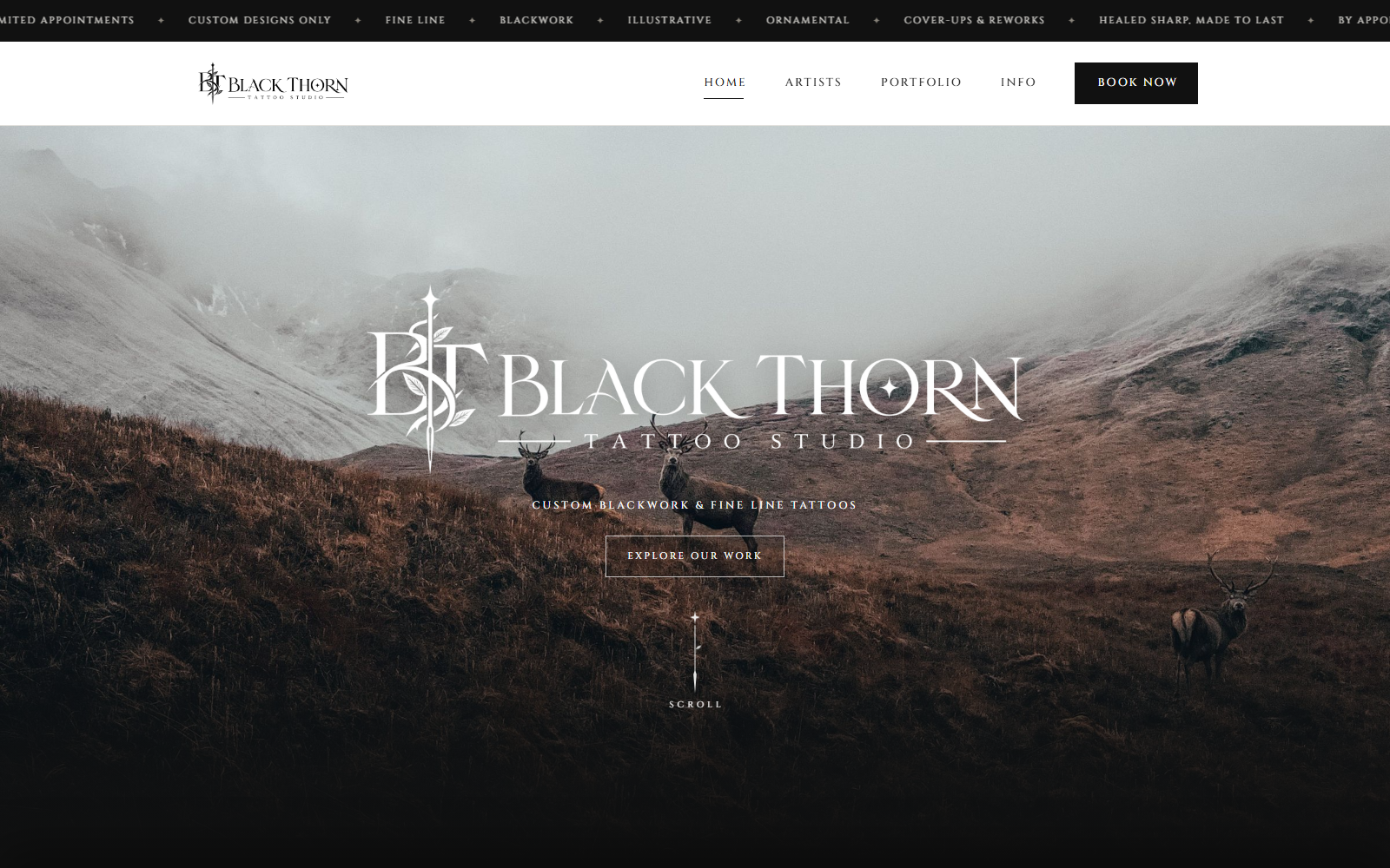
A distinctly Scottish character gives it a place. Instead of studio interiors, the brand is built around the Highlands: red deer on a hillside, mist sitting low in the glen, muted browns and greys.
The identity
The centre of the identity is a thorn-and-dagger monogram set inside a high-contrast serif wordmark. It was drawn to read as clearly as a stamp on a shopfront, a business card or a healed-work post on social as it does as a logo on a screen.
- Custom thorn-and-dagger monogram
- High-contrast serif wordmark
- Designed to work small, in print and on social, not only on screen
- Monogram and wordmark usable together or apart
Colour, type and imagery
The palette comes straight from the photography: deep, muted browns and greys rather than pure black and neon. The serif type carries the same high contrast as the wordmark, so headings feel part of the brand rather than placed beside it. Highland photography does the job most studios give to interior shots, setting the mood before a single tattoo is shown.
- Muted, photography-led palette
- One type system shared by the logo and the website
- Landscape imagery that gives the studio a sense of place
From brand to website
The homepage opens on the wordmark over a misty Highland glen, so the first thing a visitor meets is the brand itself. The same type, colour and imagery run through all five pages: home, artists, portfolio, info and booking.
Development
The site is built to help someone go from browsing to booking. The portfolio is grouped by style, and the process is laid out in four steps from first enquiry to tattoo day, so a nervous first-timer knows exactly what happens.
- Portfolio grouped by fine line, blackwork, illustrative and ornamental
- Booking enquiry that captures idea, placement, size and references
- Pricing, process and aftercare in one place
- Responsive build, checked on phones and computers
A note on this project
The Black Thorn website is available as a template at £1,000, customised for your studio. If you want a brand and website made for your own business, that is our Brand Identity service, on its own or together with a website.