Brand identity · 2026
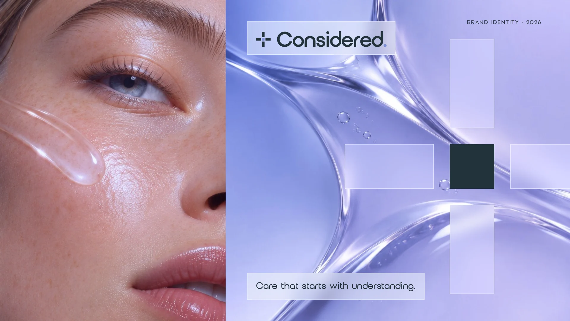
Considered
A skin clinic identity built on understanding.
Brand strategy and visual identity for an independent, nurse-led skin clinic in Edinburgh, built around thoughtful consultations, clear advice and personalised care.
- Client
- Considered
- Sector
- Nurse-led skin clinic
- Location
- Edinburgh
- Year
- 2026
- Services
- Brand strategy, Visual identity
- Audience
- Adults 30–55, first-time visitors
00Overview
Care that starts with understanding.
Brief
An identity that feels clinical and trustworthy, without the cold distance of a medical brand or the softness of a spa.
My role
Brand strategy, logo design, visual identity, typography and colour, art direction, brand guidelines, and print and digital applications.
Direction
A modern clinical identity: clear type, confident contrast and honest skin photography, with the person at the centre.
The clinic
Considered is an independent, nurse-led skin clinic in Edinburgh, growing from a solo practitioner working in rented treatment rooms into a dedicated clinic of its own.
It offers skin consultations, personalised treatment plans and ongoing skincare advice. Every appointment starts with understanding the person’s concerns, explaining their options clearly and helping them make an informed decision, without pressure.
Its main audience is adults aged 30–55 looking for support with skin concerns or changes over time. The brand had to feel just as welcoming to men and to anyone considering professional skin treatment for the first time, and carry the move from solo practice to dedicated clinic without losing the warmth of one trusted nurse.
01Logo
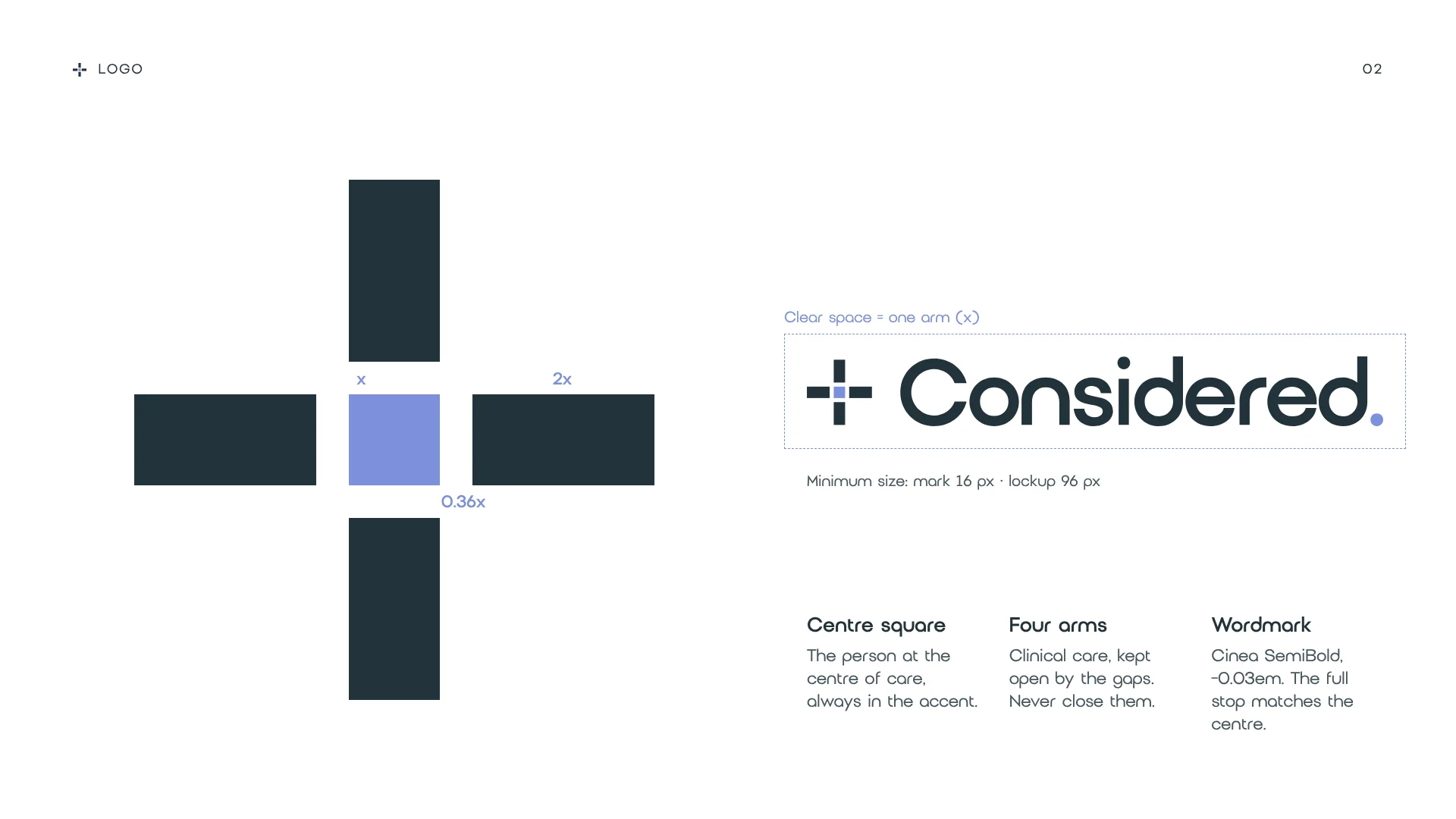
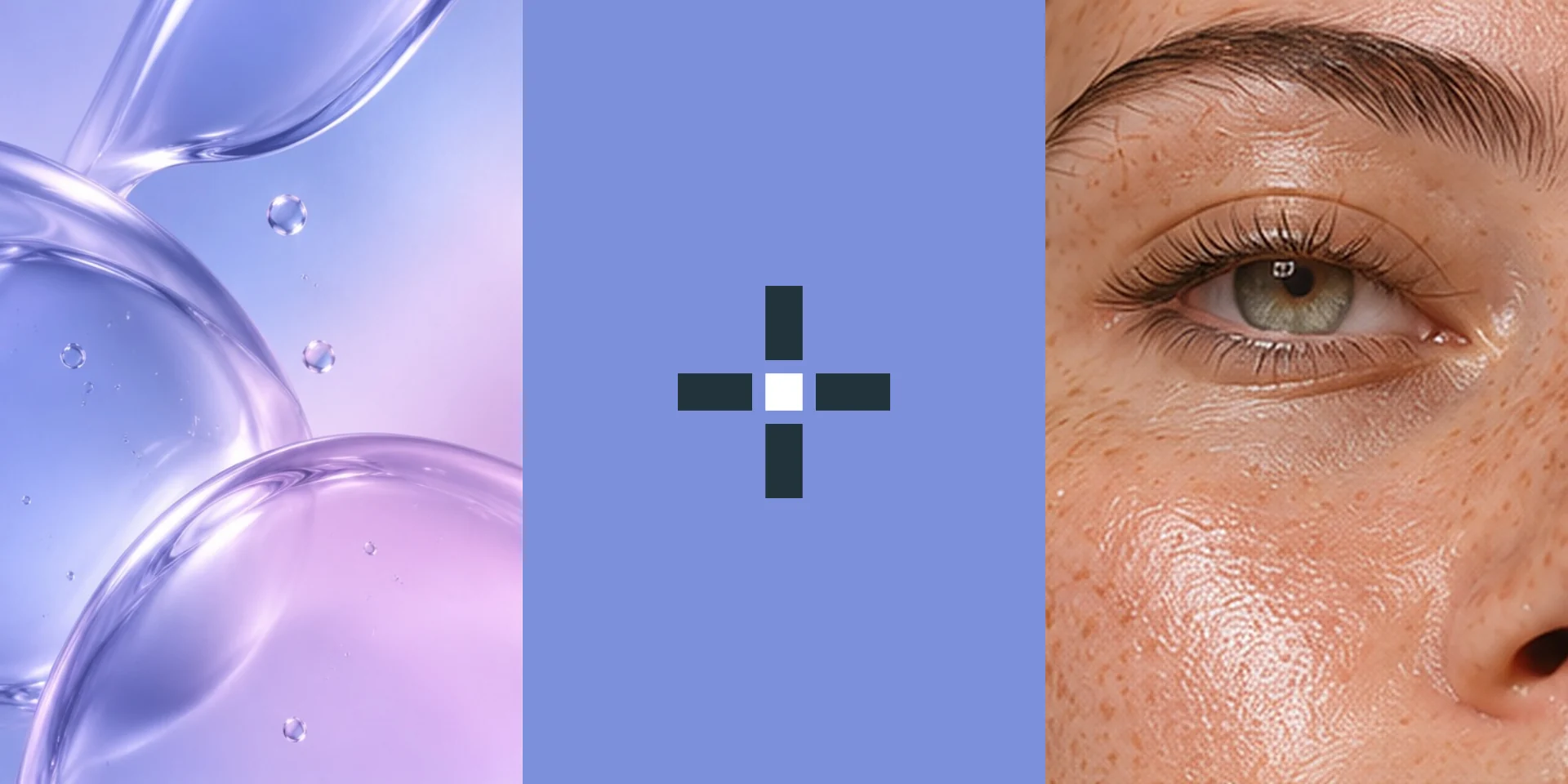
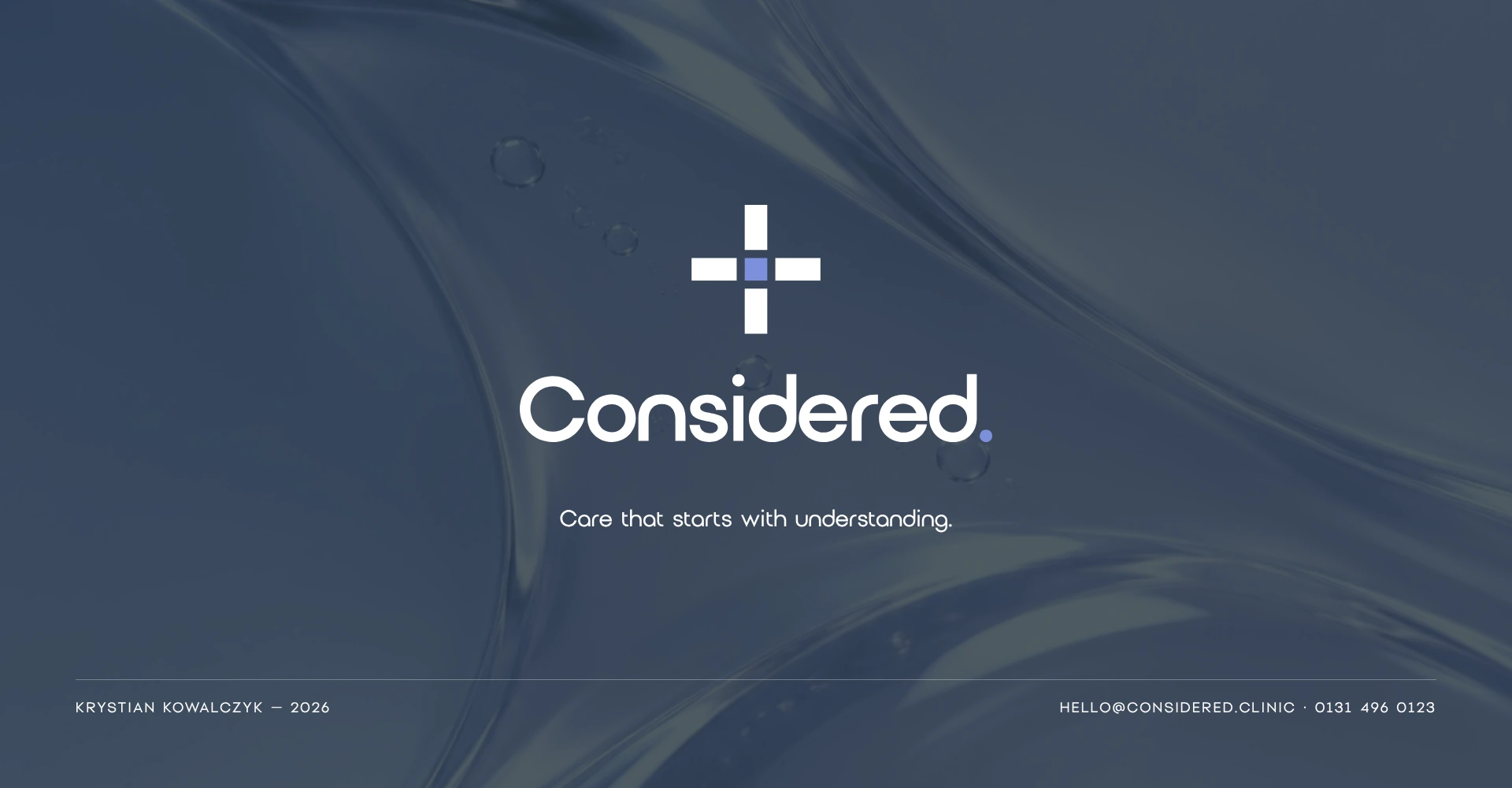
An open cross, with the person at the centre.
A medical cross with gaps left open: space to listen, with the Wisteria Blue square for the person at its heart. The full stop matches the centre.

02Colour & type
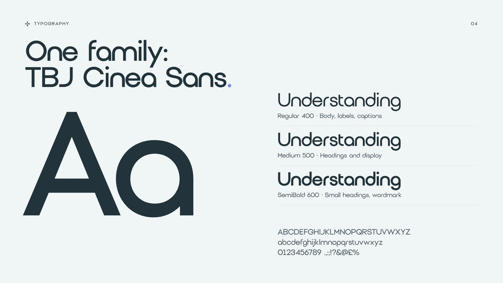
Calm, clinical, never cold.
Wisteria Blue leads; Ink gives contrast; Mist and Haze keep everything light. Pink Orchid is used once per piece, at most.
- Wisteria Blue#7C90DBSignature colour
- Ink#22323AText and deep panels
- Slate#46575FSecondary text
- Mist#F0F4F6Light backgrounds
- Haze#DFE7ECPanels and rules
- Pink Orchid#E5BEEDOne highlight per piece, at most
03The space
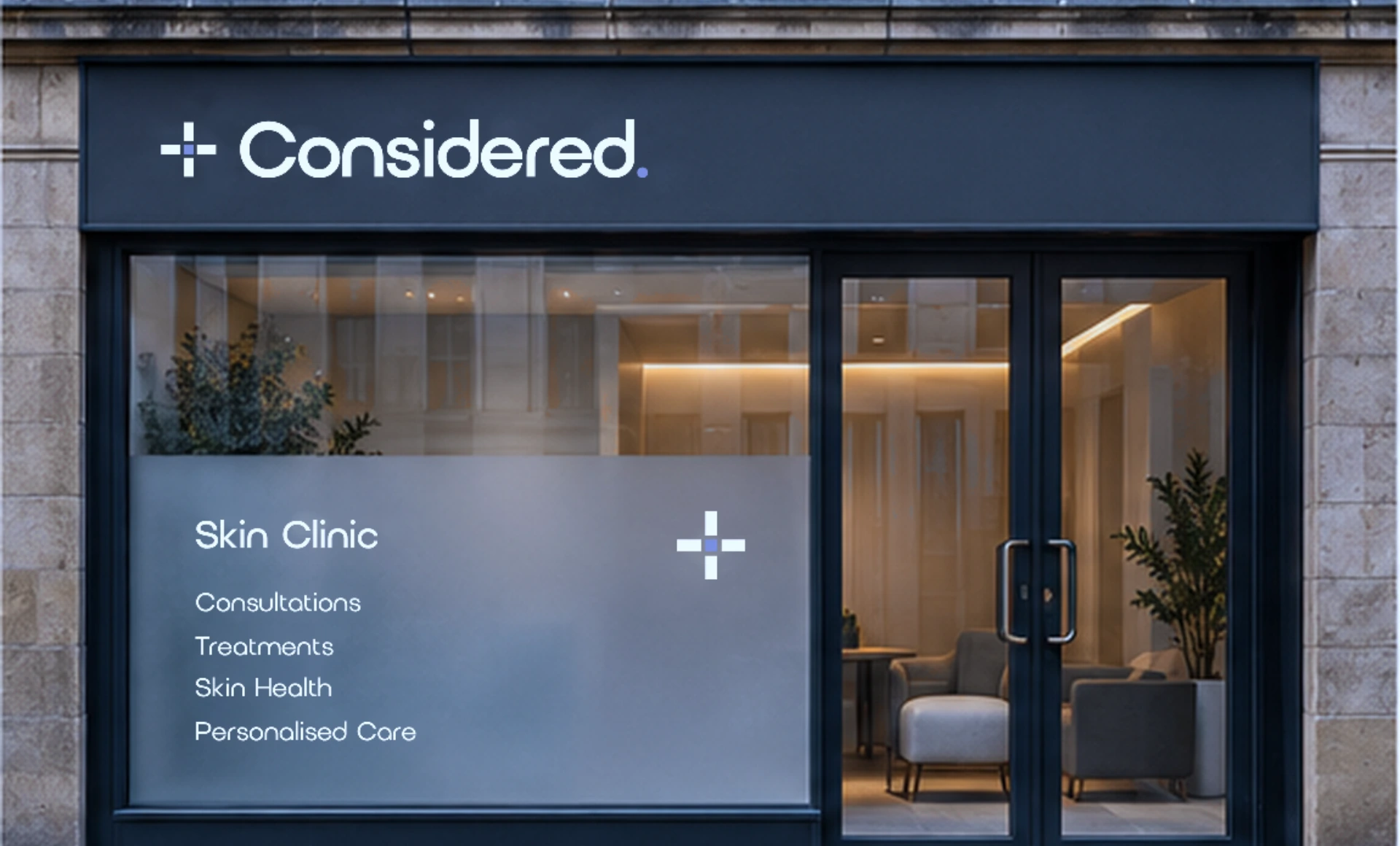
A calm space to listen.
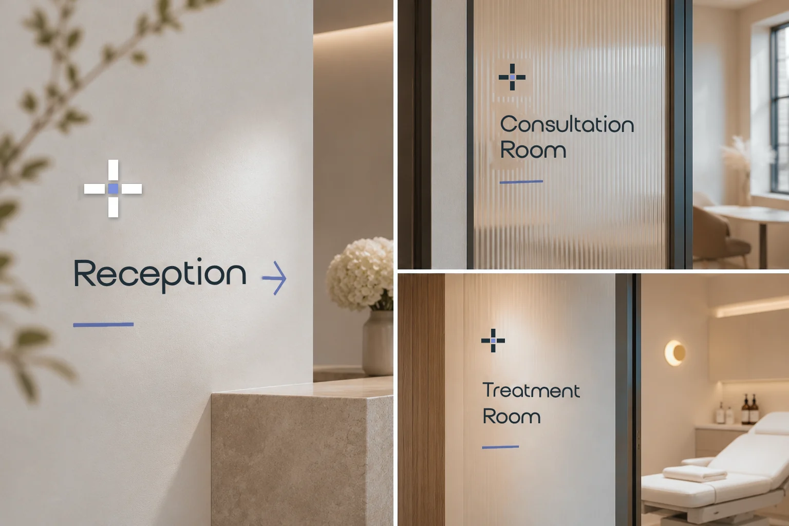
From a clear first impression on the street to a calm, clearly signed clinic inside.
The experience
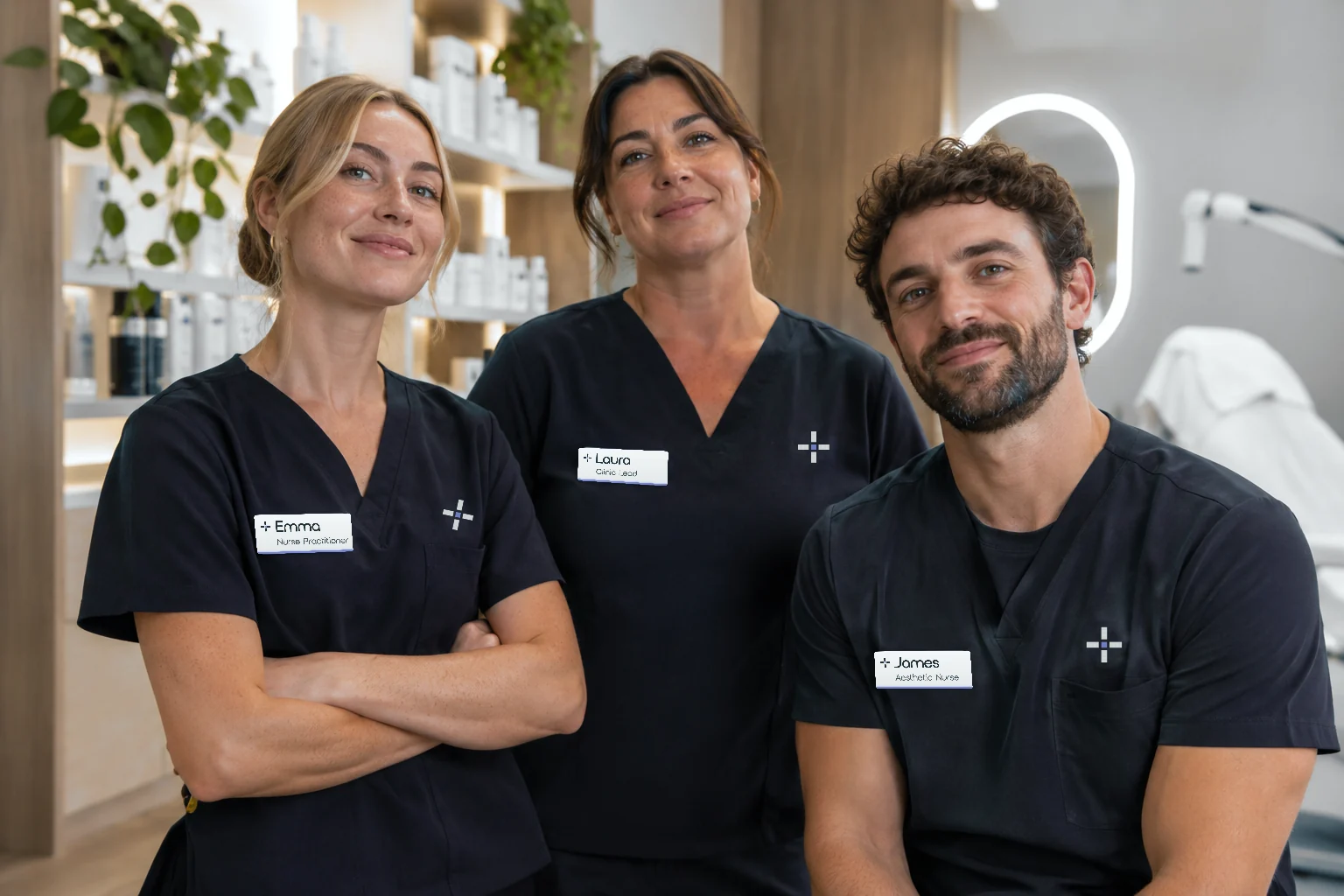
Visiting Considered should feel personal and reassuring: familiar faces, time to ask questions and clear information before and after every appointment.
The identity was planned around a small team, so every touchpoint feels like it comes from the same people.
- Founder and lead nurse practitionerLeads consultations, treatment planning and clinical care.
- Aesthetic nurseProvides suitable skin treatments and routine skincare guidance.
- Clinic coordinatorManages appointments, enquiries and follow-up communication.
04In every detail
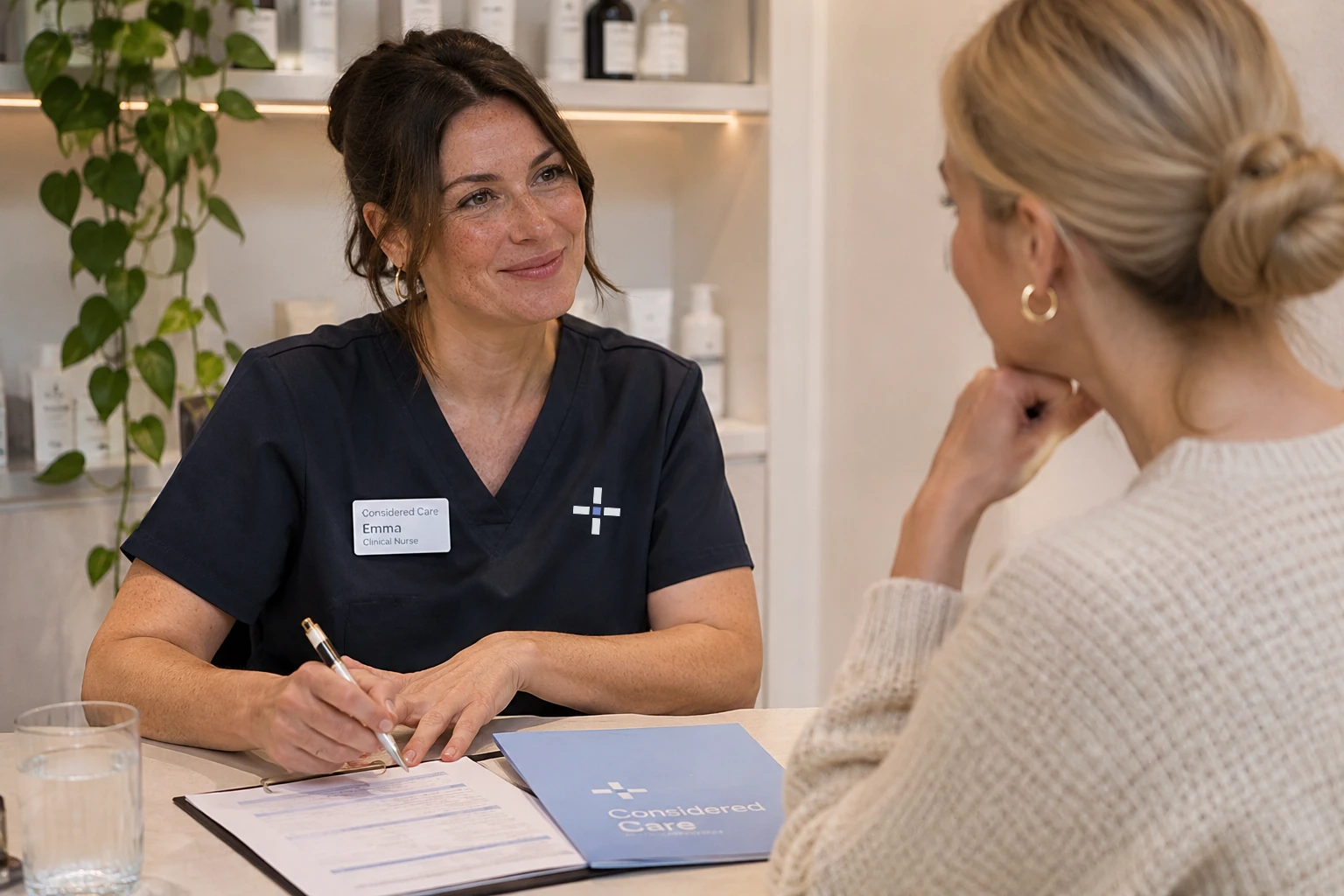
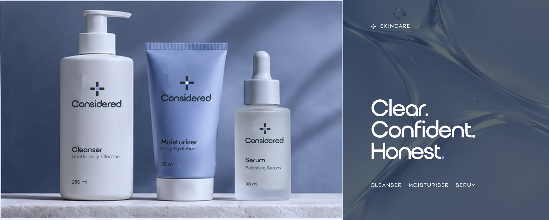
Clear. Confident. Honest.
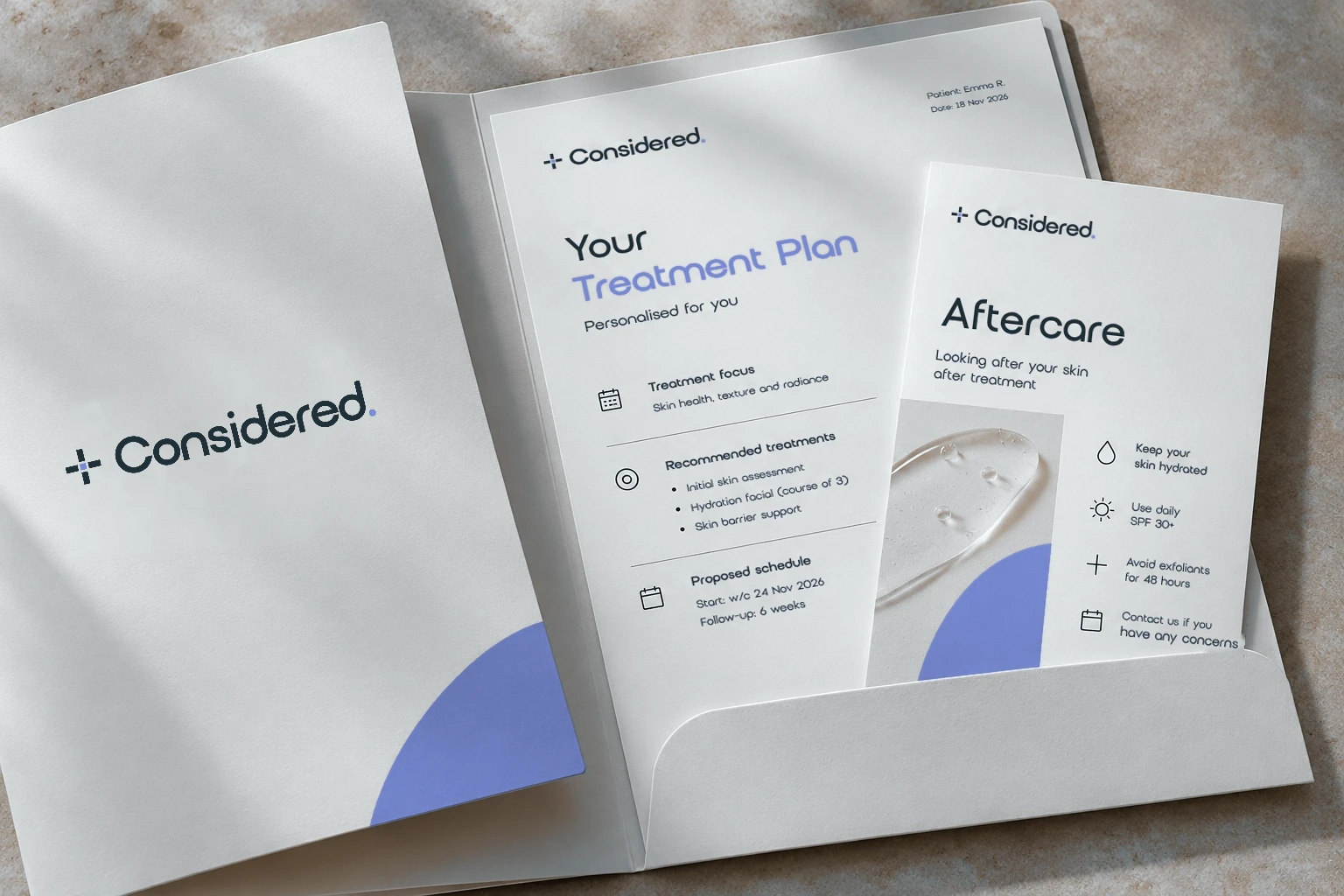
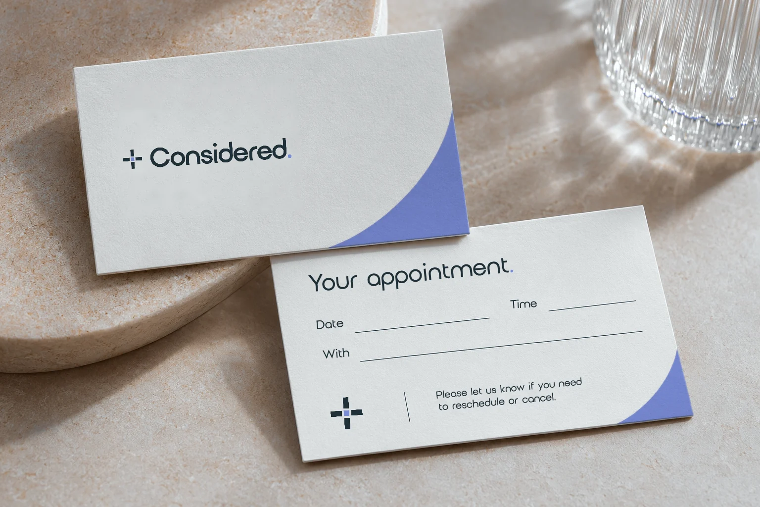
The same calm, honest feel runs through treatment plans, aftercare, appointment cards, signage and packaging.
05Content
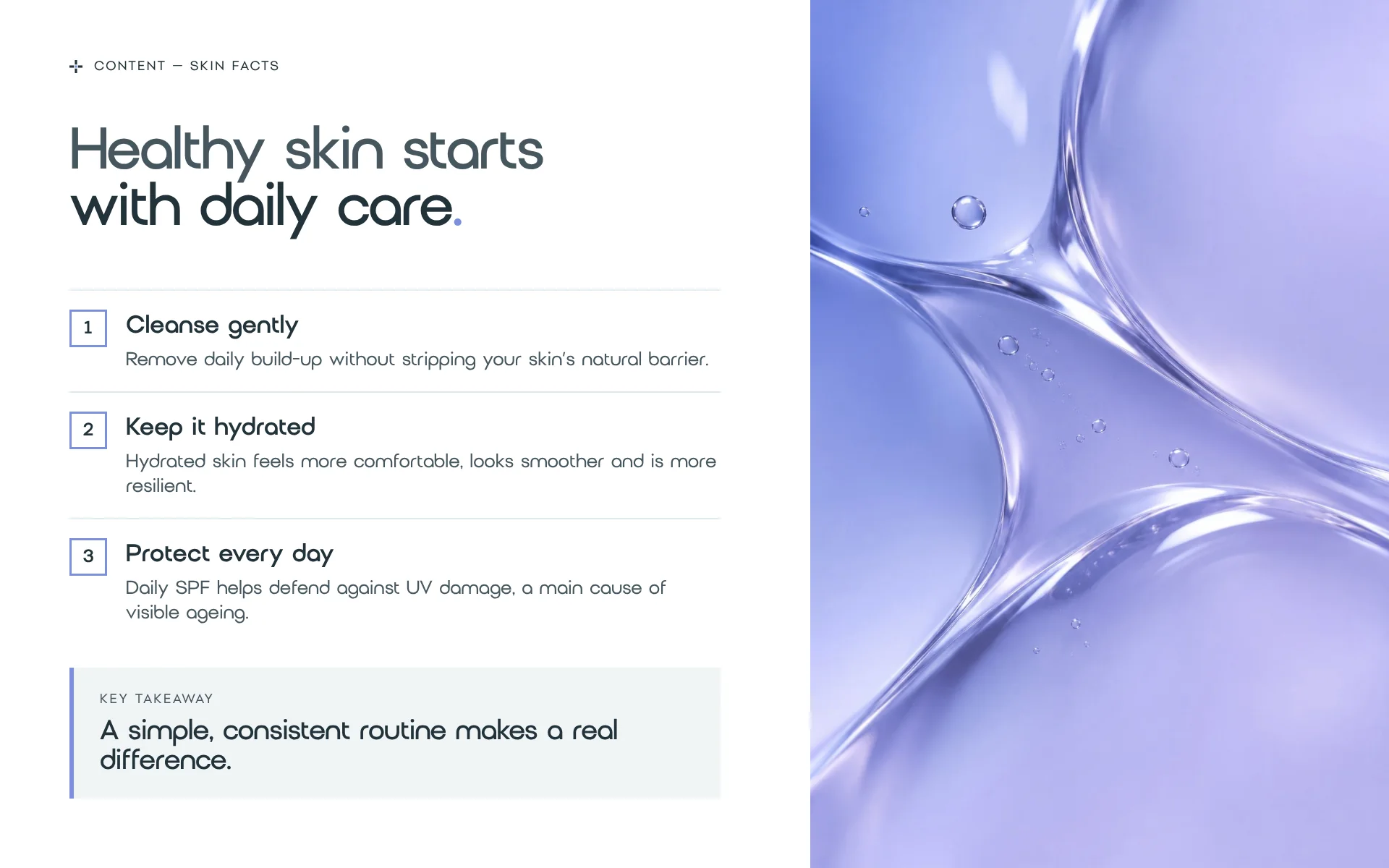
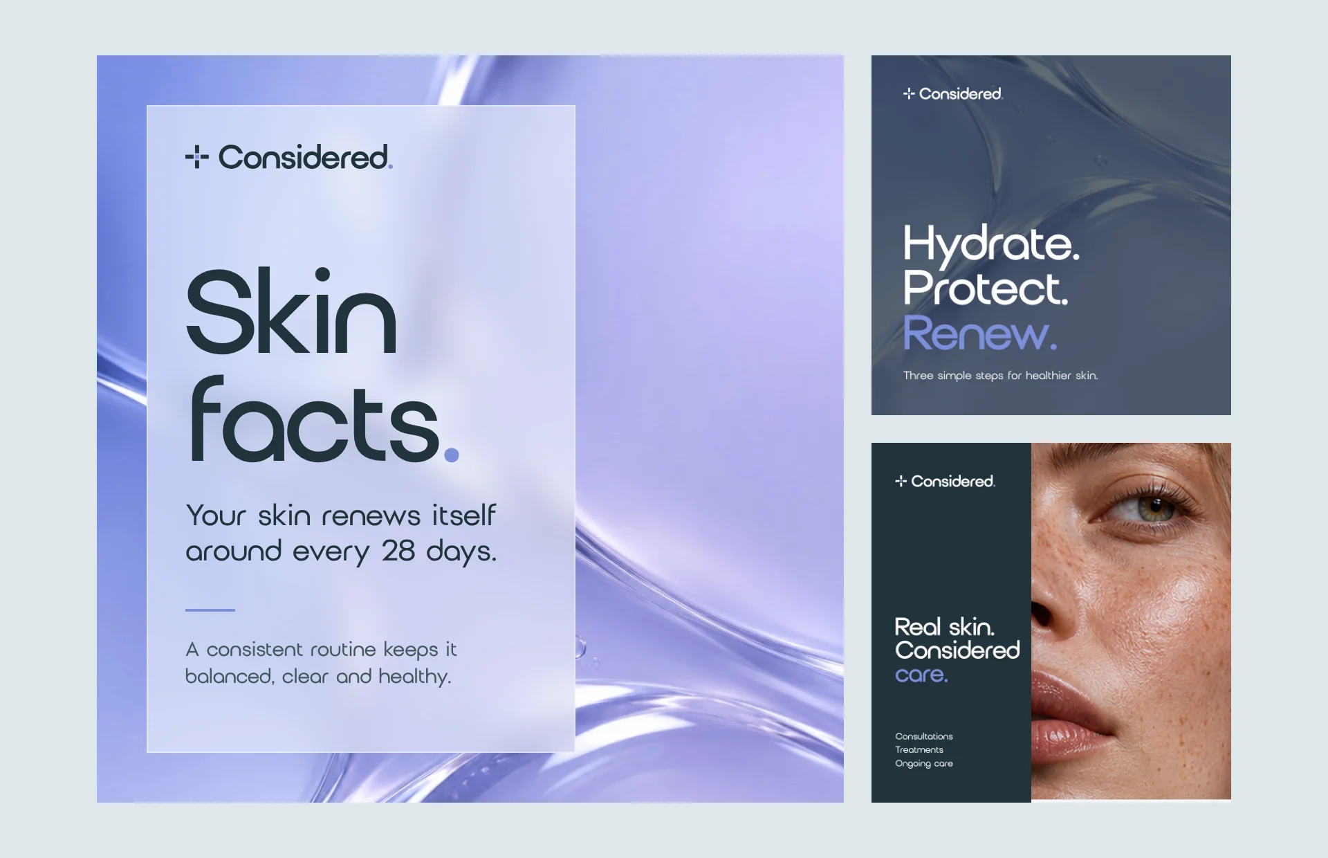
Clear advice, shared simply.
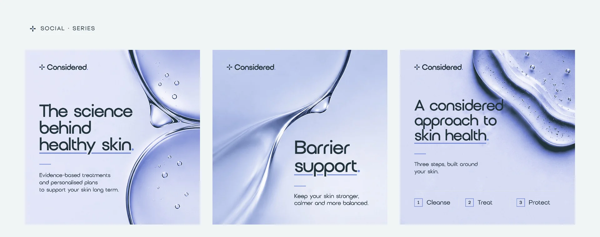
Patient guidance and social posts use the same calm layouts: one idea, a few plain steps, a single takeaway.
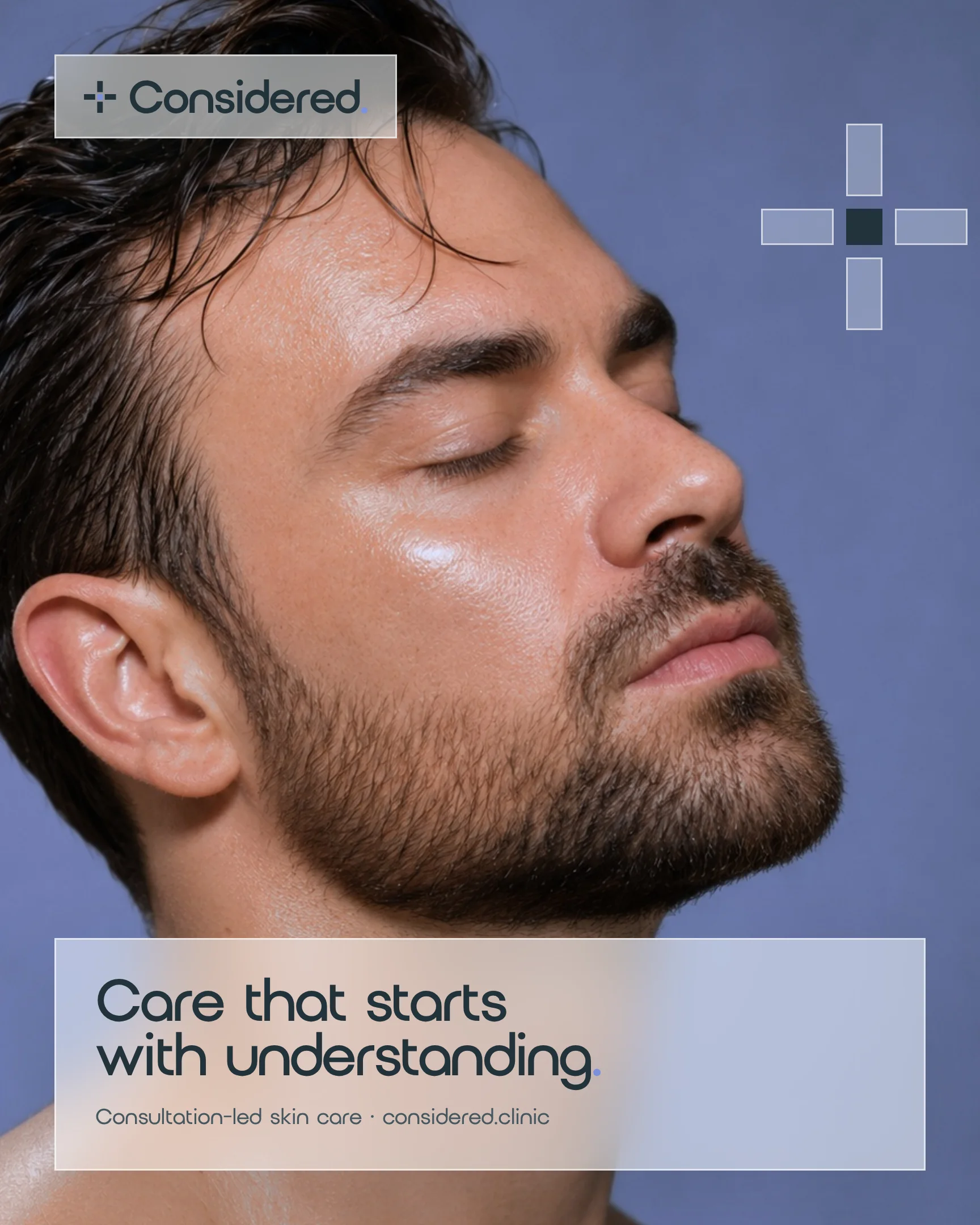
06Campaign
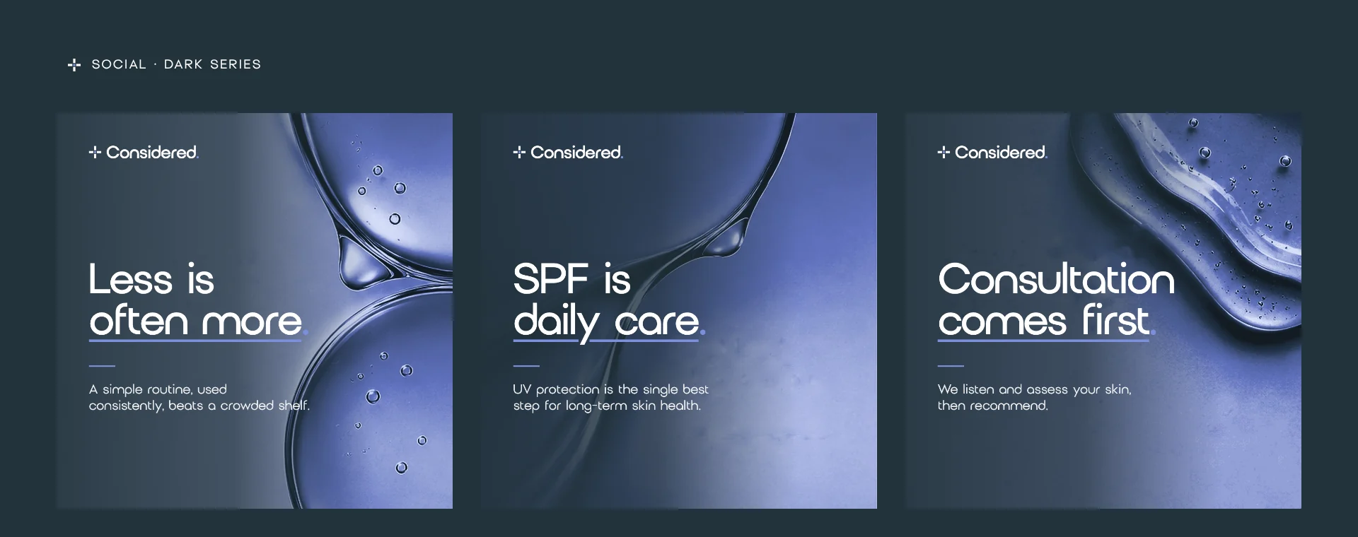
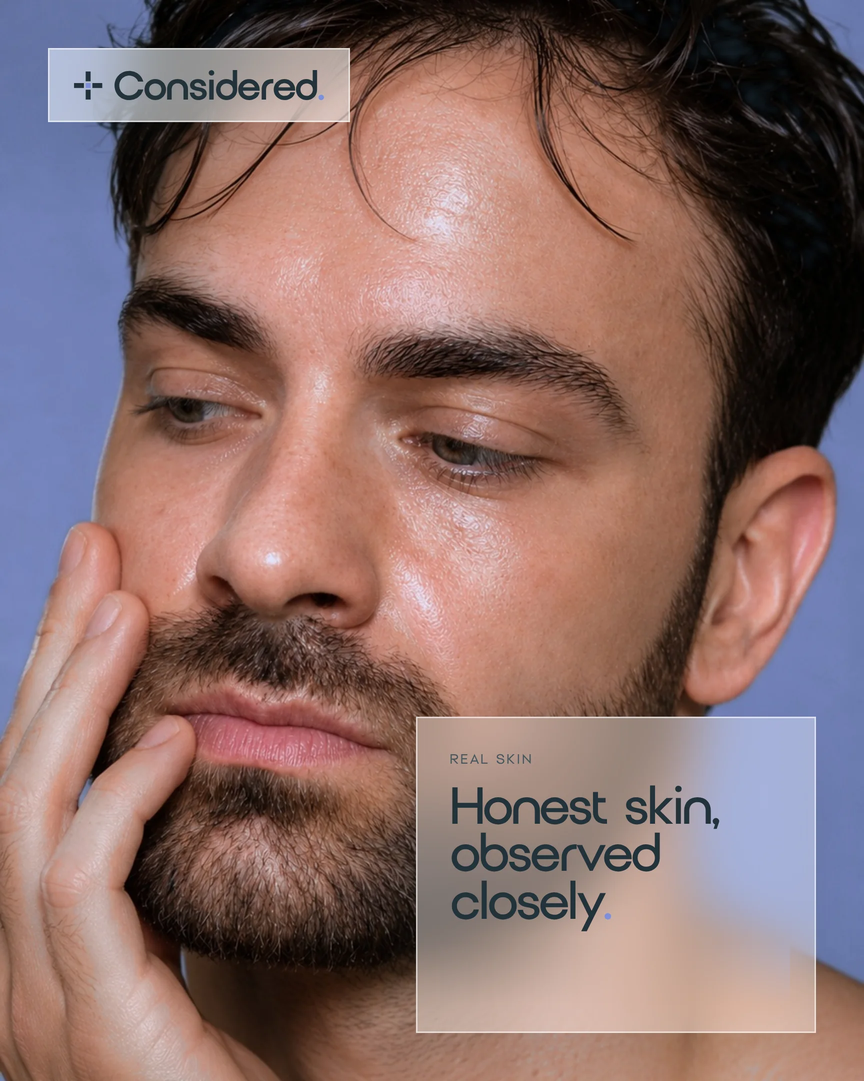
One idea at a time.
Each piece leads with one clear line, one colour and nothing extra.
Next project
Black Thorn
Tattoo studio. A complete brand identity and website for a tattoo studio, designed together from the name up.
View case study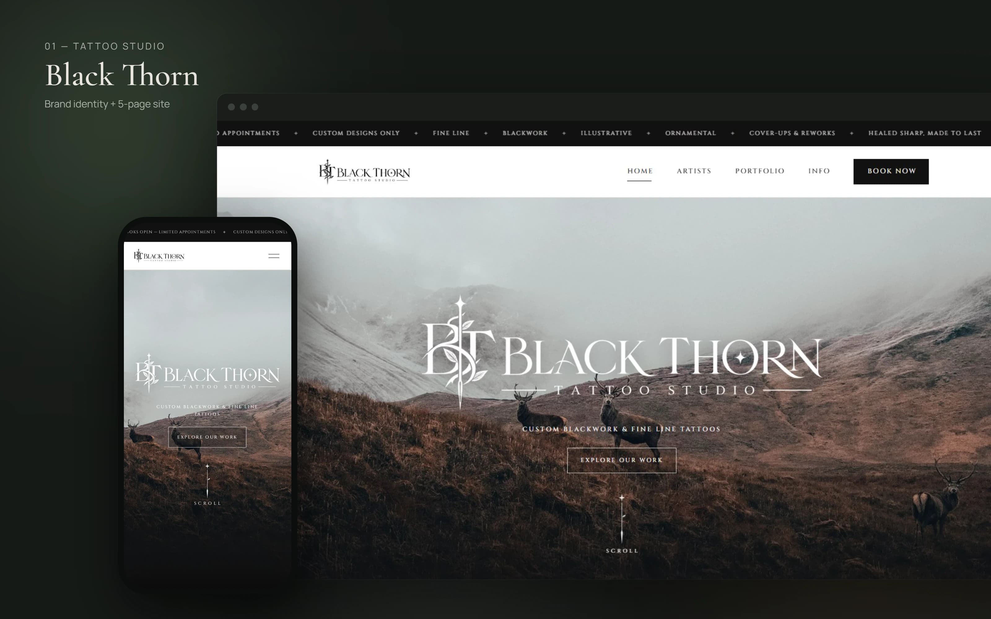
Looking for an identity like this?
Brand identity projects from £1,500 include discovery and positioning, a logo suite, colour and typography, concise brand guidelines, three agreed applications and two revision rounds.
Packaging, motion and additional materials are quoted separately. See the Brand Identity service